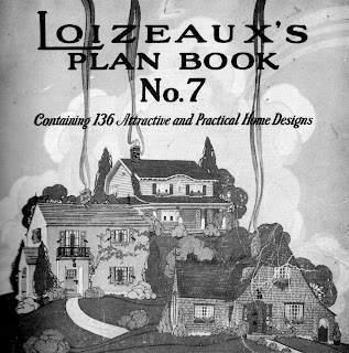
Lots of different companies cashed in on the building boom of the late 1910s and 1920s (as my growing stack of old home plan books will attest to). Tons of lumber companies followed the model set by Sears, Gordon Van Tyne, Wardway, Bennett, Aladdin, and others by publishing their own books of plans. Loizeaux, based out of several locations in New Jersey, was a lumber and building supplies company that decided to expand their customer base by encouraging people to buy plans from them...plans that could then be erected with their materials, of course. This plan book seems to be geared more toward the builder, given the amount of advertisements for building system products in its pages.
The Designs
The designs look like typical homes of the 1920s--modest, 2, 3, and 4 bedroom homes with nice curb appeal. Some have a more "bungalow" appearance (ripping off Sears's popularity). A large majority of the homes are neo-colonial, tudor or Dutch colonial. There are a few oddities that reflect a Spanish Mission style. Even though the homes are obviously designed for the middle class, most of the homes have a "service entrance", indicating that people still had maids or other house servants. A large number of the homes have "sun rooms" or "sun porches", which were just rooms with extra windows. People believed in the healing power of the sun at this time--even hospitals of the time had "sun porches" where patients were encouraged to convalesce in the healing rays of the sun--melanoma not withstanding. Below are a few favorites. Be sure to scroll down and see some of the ridiculous advertising.
 |
| Check out the rear entry--you had to walk through the kitchen or a bathroom AND a bedroom to get to the living area from it. |
 |
| A "tudor"-styled home. Small, but charming. |
 |
| This is NOT...I repat...NOT a Sears home. |
RIDICULOUS BUILDING PRODUCTS/AND ADVERTISING
 |
| An ad for tile. Look at the ceiling in the kitchen (top picture). Why on earth would you need a tiled kitchen ceiling? Pie fight, anyone??? |
 |
| Not outrageous--this was the original rear cover. |


Was this the same Loizeaux company which now does those spectacular demolitions?
ReplyDeleteThis was such an intriguing post—Loizeaux may have been a one-hit wonder in the prefab world, but what a fascinating contribution! I really enjoyed your deep dive into their brief yet bold presence in the architectural landscape. It's always interesting to learn about companies that took a risk with design innovation, even if they didn’t stick around long. Your attention to the home’s construction, materials, and aesthetic appeal gives readers a full sense of why this project was special, and perhaps even ahead of its time. It’s a reminder that sometimes architectural history is shaped as much by the short-lived experiments as by the big names. If any of these rare homes are still standing and in need of thoughtful restoration, R for Remodelers would be an ideal team. They specialize in preserving unique character while updating for modern living. Thanks for sharing another gem!
ReplyDelete